
The Red Cow Hotel
Logo Redesign


A LITTLE BIT ABOUT MY DESIGN PROCESS
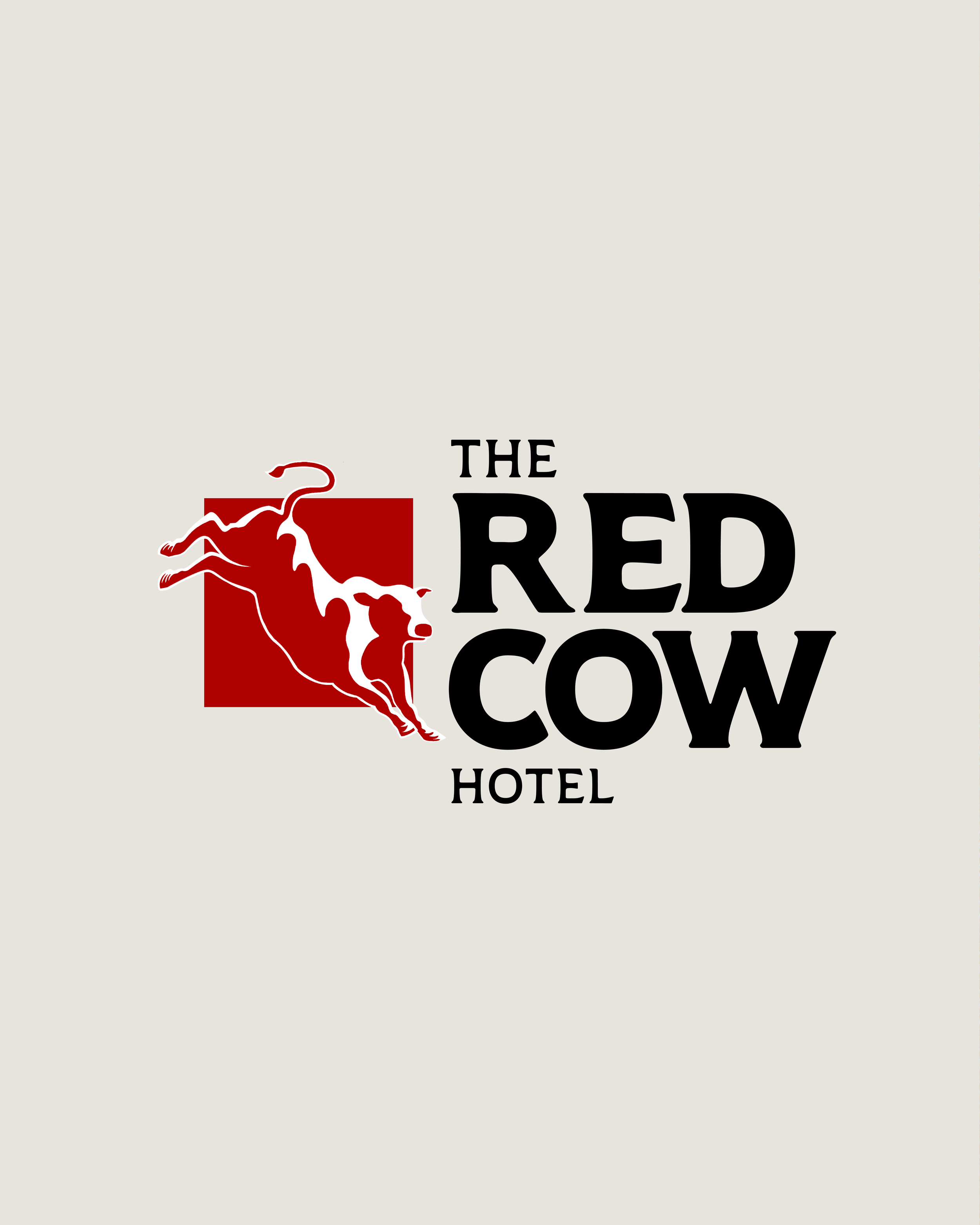
Reimagining a Local Icon – The Red Cow, Penrith
Every day on my commute, I pass The Red Cow a well-known pub in Penrith. As a designer, I’m always observing and challenging myself to see things differently, so I decided to turn this everyday encounter into a personal design brief.
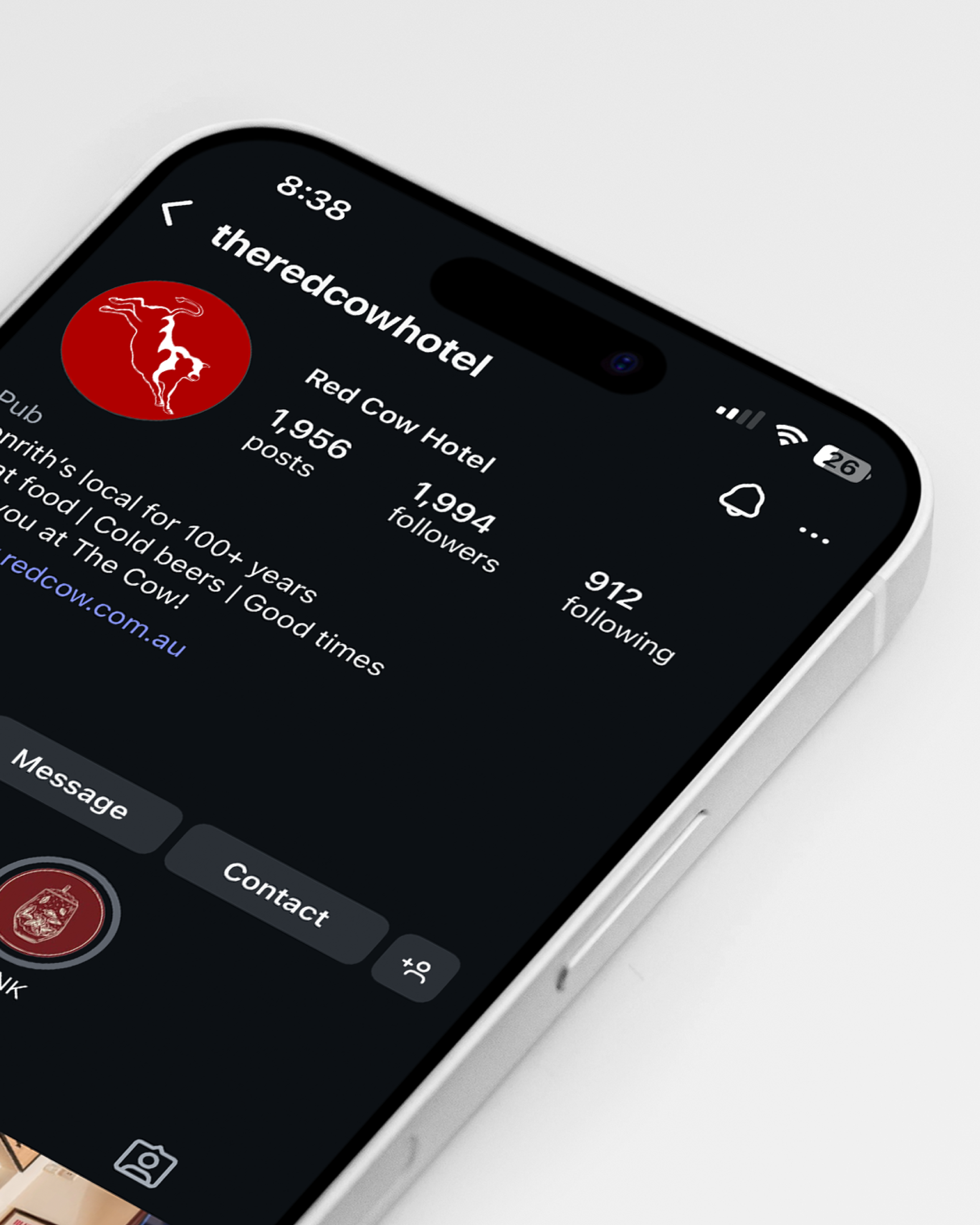
I set myself the task of rebranding The Red Cow , keeping its local charm, but breathing new life into it with a refreshed logo design with a more distinct personality.
This is my take on an iconic piece of Penrith culture reimagined through typography, iconography, and character.
A small tribute to a familiar face on my daily route.
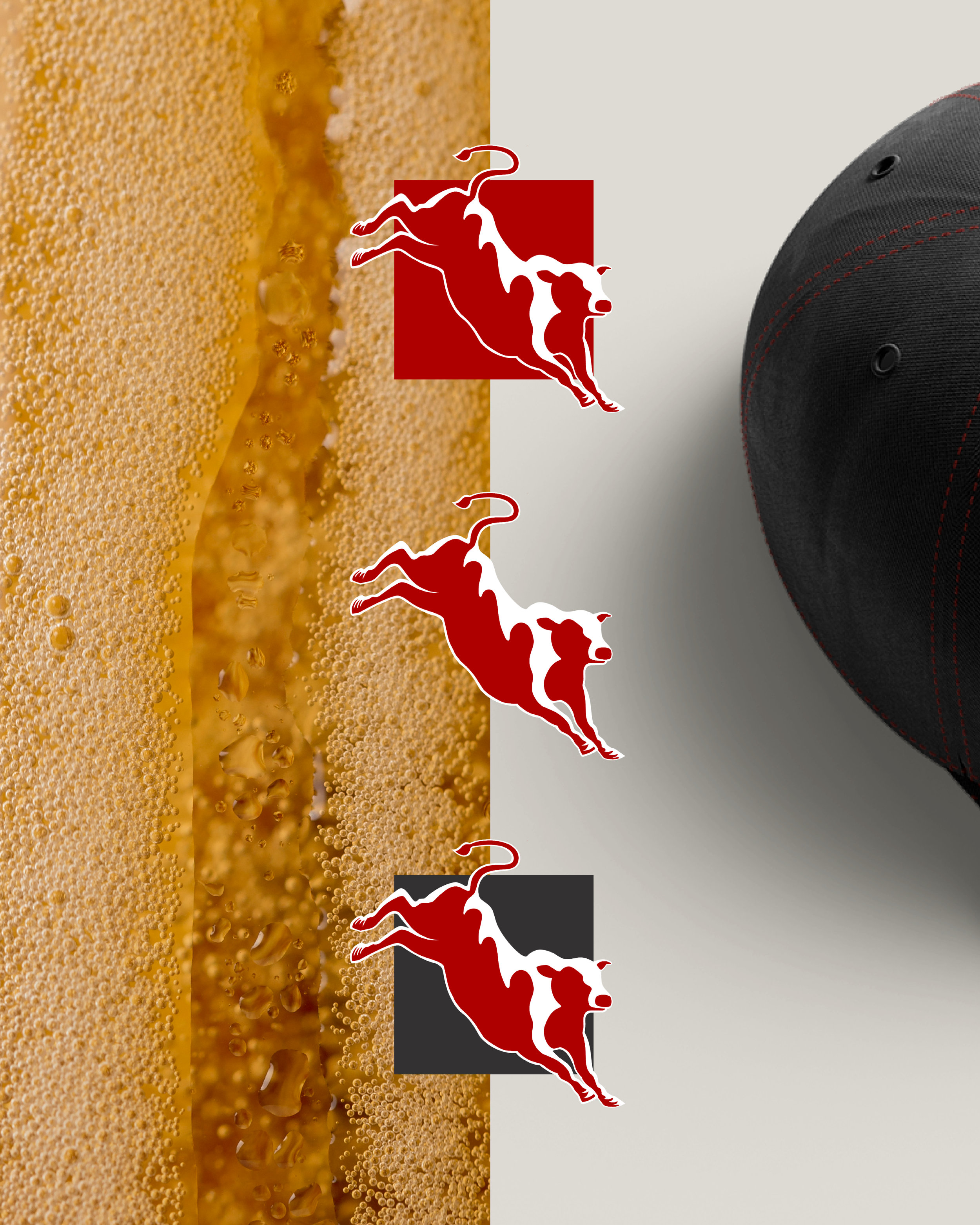
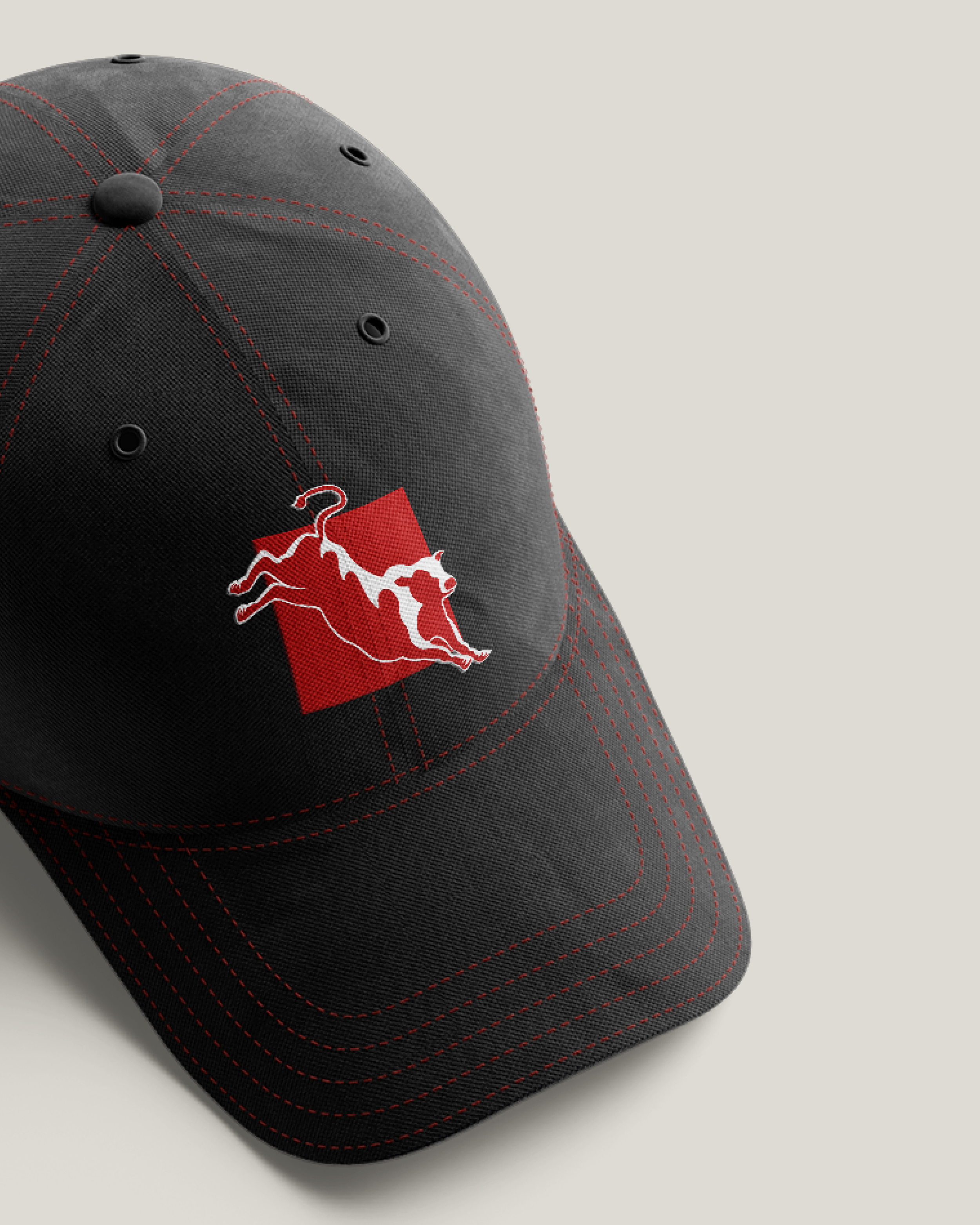
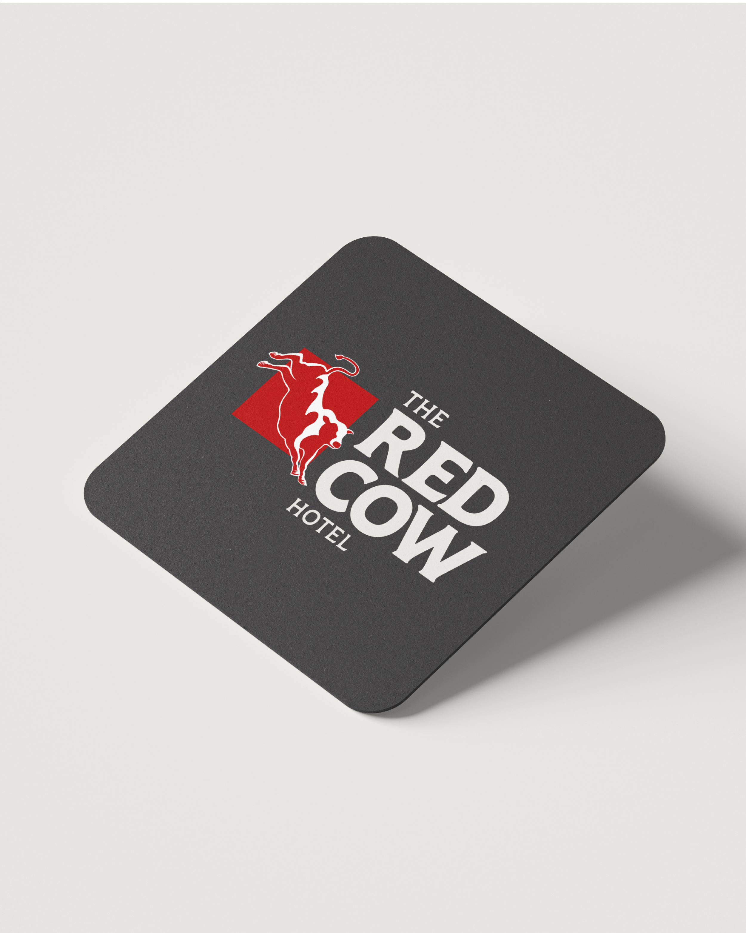
To develop this design I focused on understanding The Cow, pulling out key words I believe describe the brand such as lively, sociable, welcoming and full of character. I studied their current logo and identified what areas I could improve, for example, the typeface, the current font is quite thin and doesn’t translate as well as it could across The Cow’s multiple platforms, specifically on social media. Therefore I developed a logo that had multiple variations including an icon which I feel encapsulates the personality of The Cow.
CLIENT
Passion Project: The Red Cow Hotel
YEAR
2025